

BYS Cosmetics Rebrand
BYS is an Australian owned cosmetic brand that values fun, colour, inclusivity and affordability. I identified that they are currently failing to communicate these values across multiple touch points. Subsequently I redesigned their branding, packagings, website, point of sale and signage to more accurately represent the brands ethos.
In order to communicate the integral message that BYS stands for, I decded to use the full name in this rebrand. This grabs the audiences attention and instantly communicates the brands ethos. This notion of self love is then emphasised through the simple heart symbol in place of the O in your. Because the brand name is not entirely clear that it is a makeup brand, the tag line “makeup that’s true to you was added”.
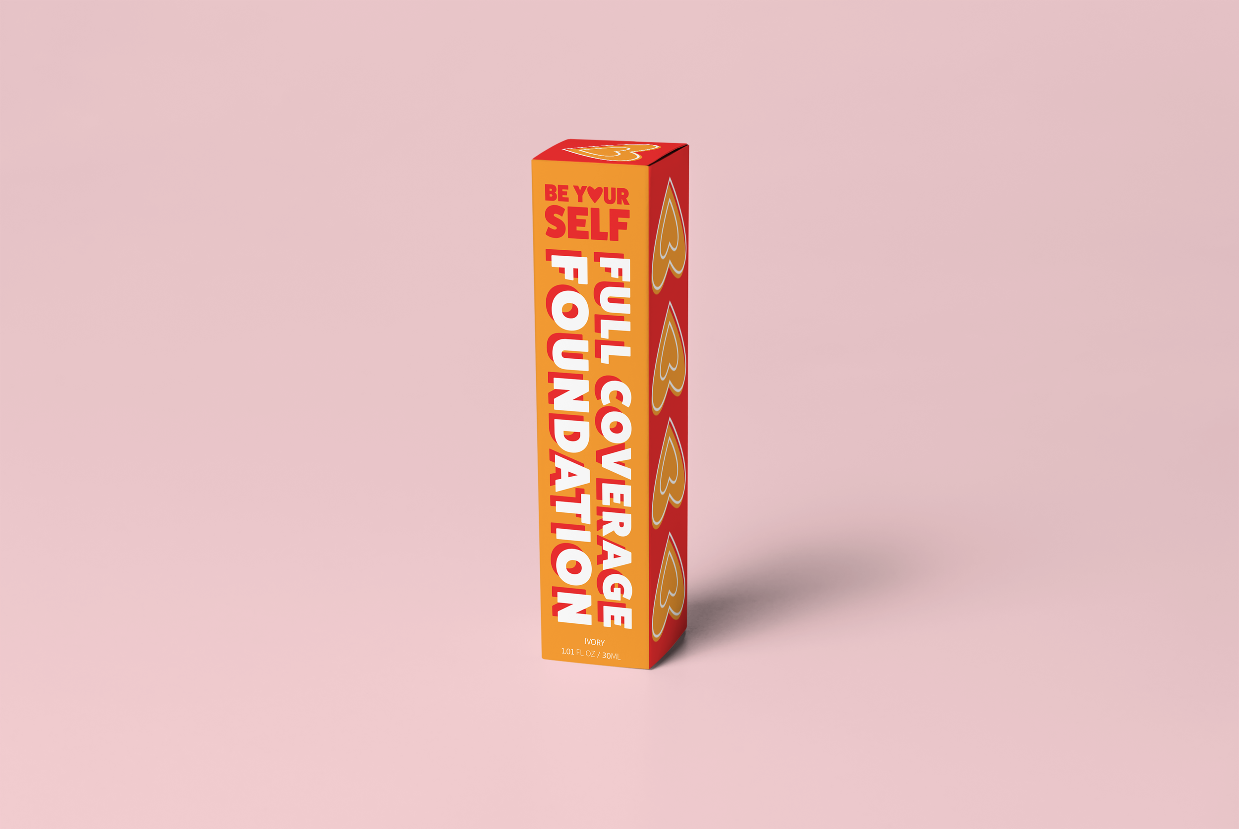
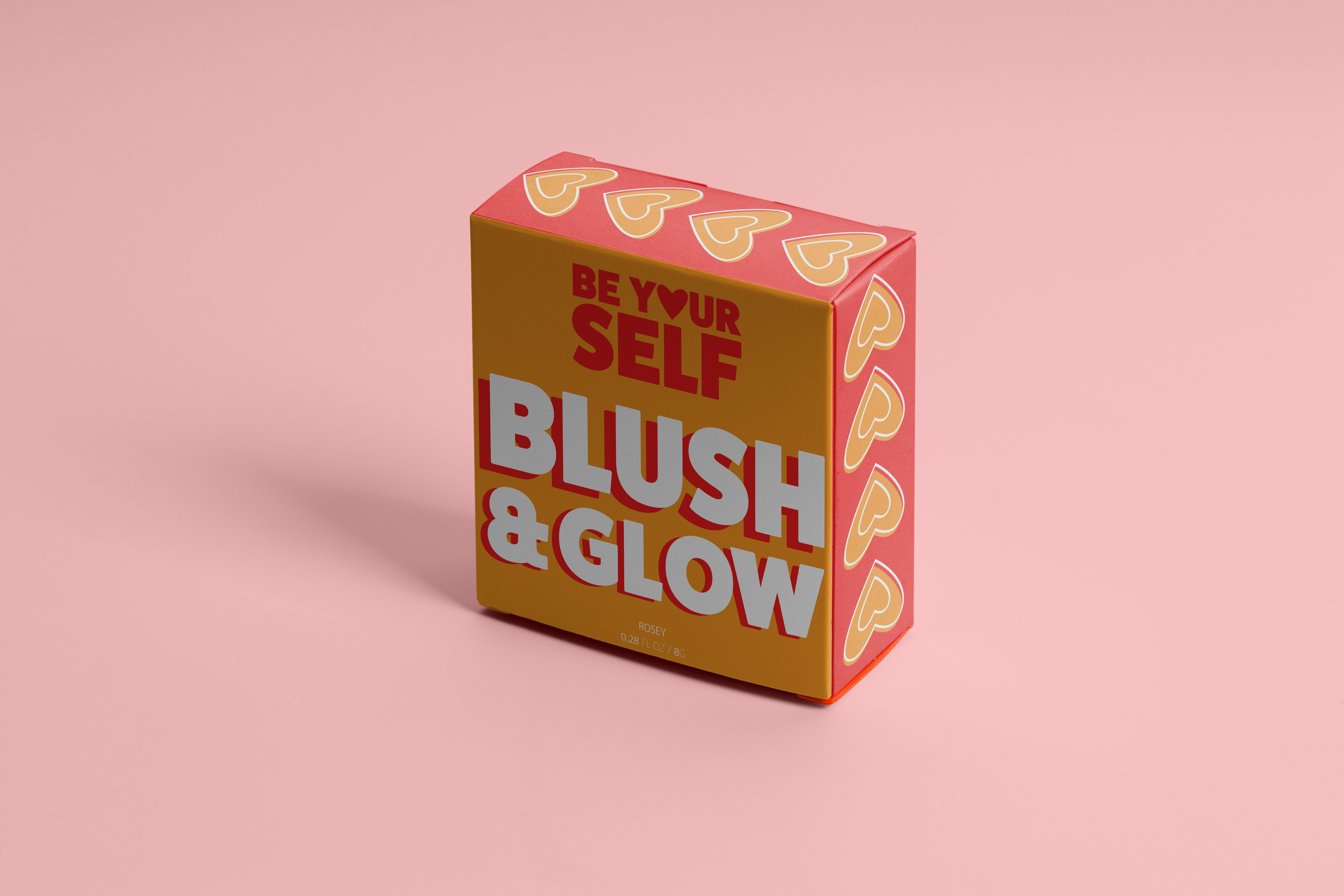
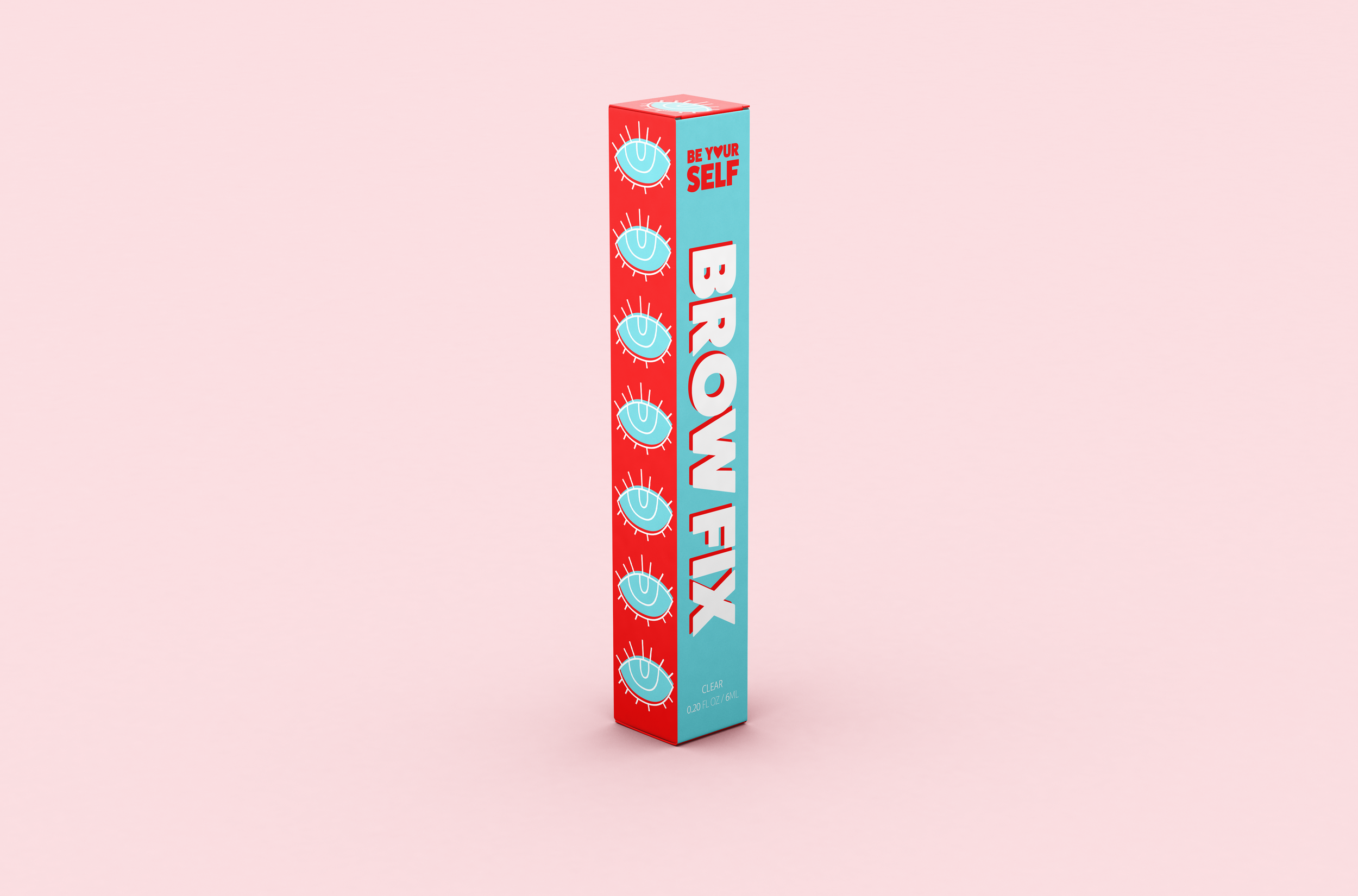


The main colour of the brand is this bold red. The blue, orange and pink are then used to break up the different types of makeup products. Because colour is important to the brand I wanted to used a bright, confident colour palette, that reflects the message of confidence and self love.
I created symbols to further differentiate the three categories of makeup products. The heart symbolises face products, the eyes, eye products and the lips lip products. I wanted to use this illustrative style to communicate the brands fun, playful nature.
Plastic has been removed from all packaging to increase the brands sustainability.
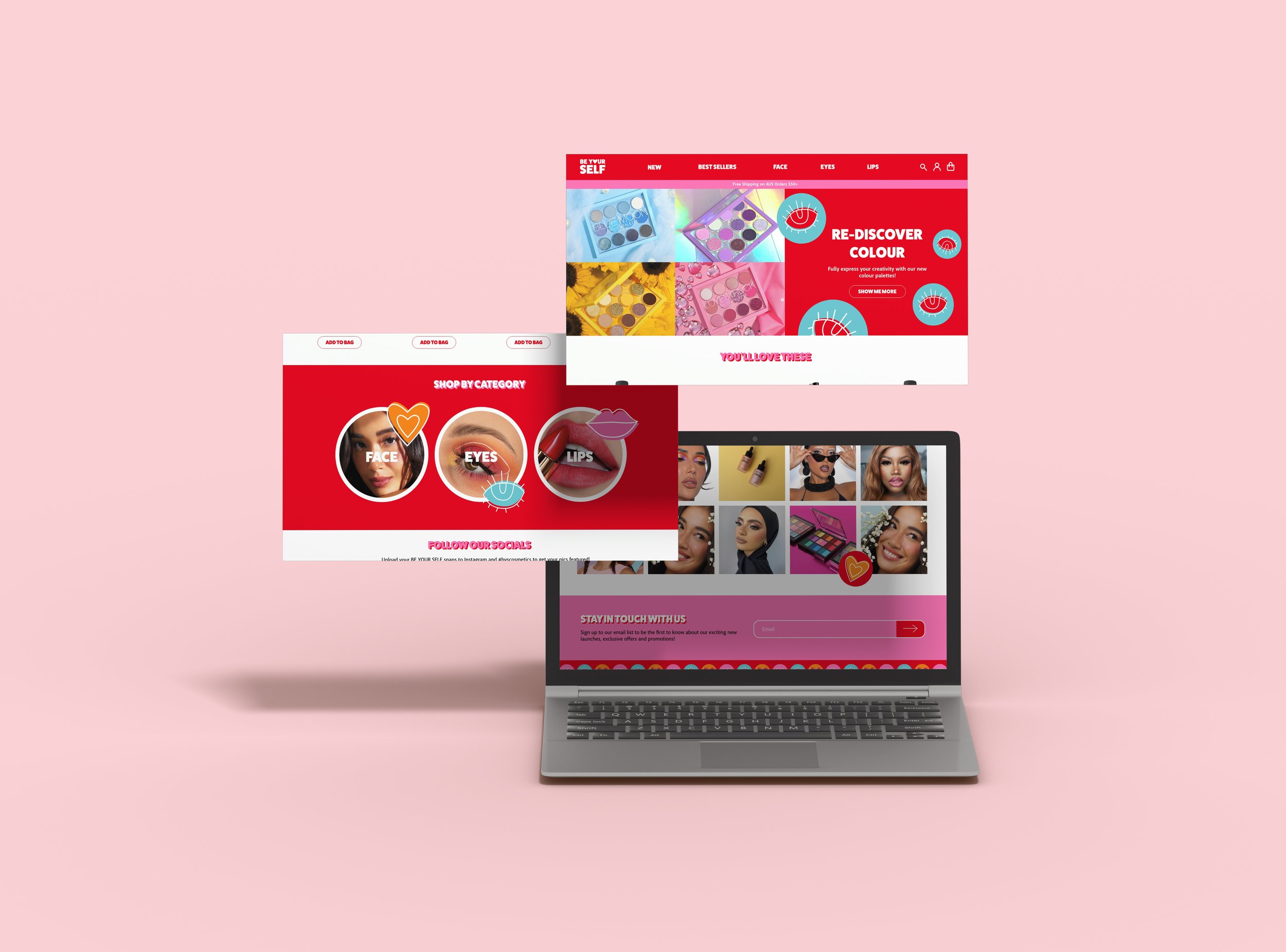
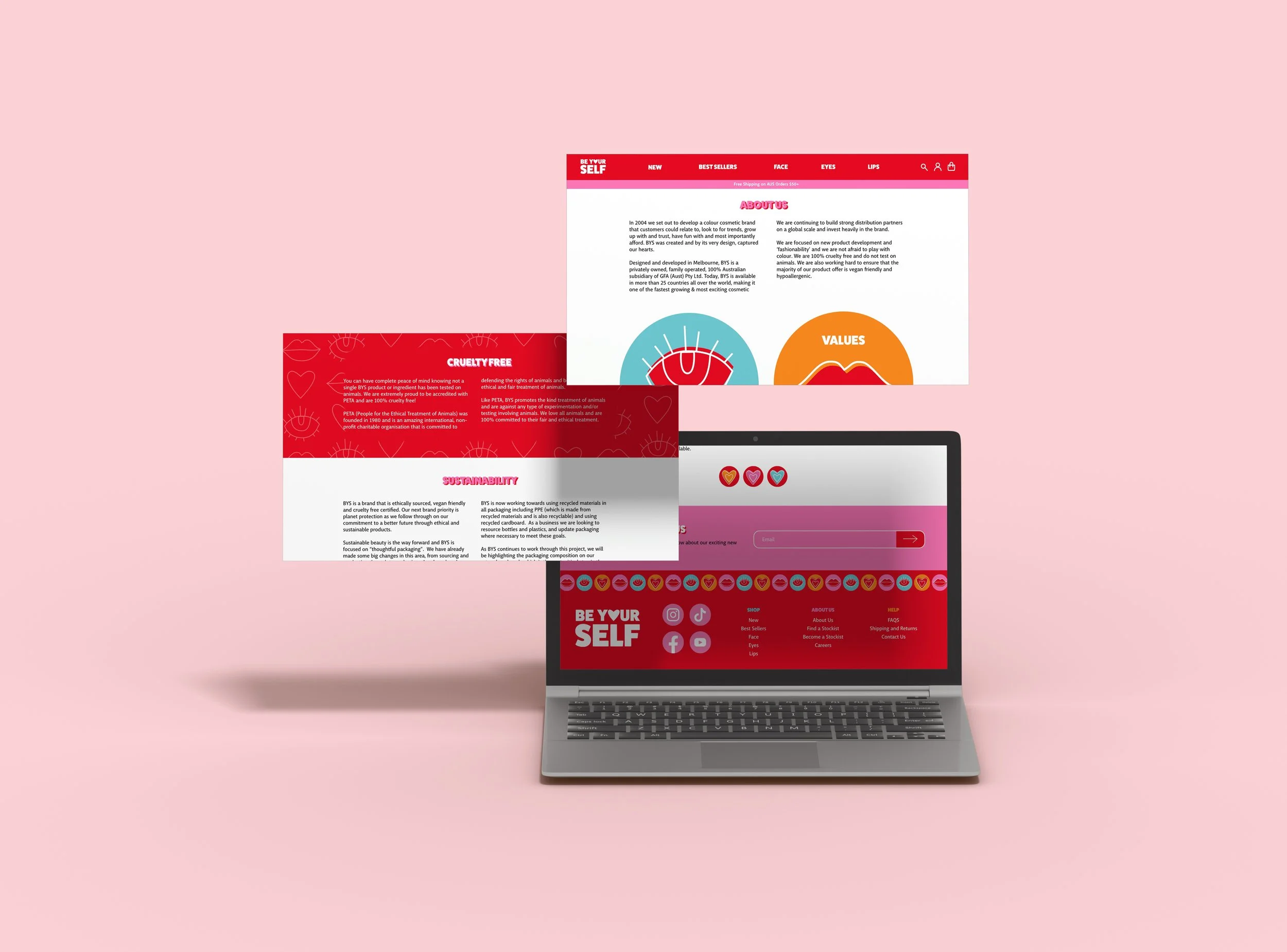

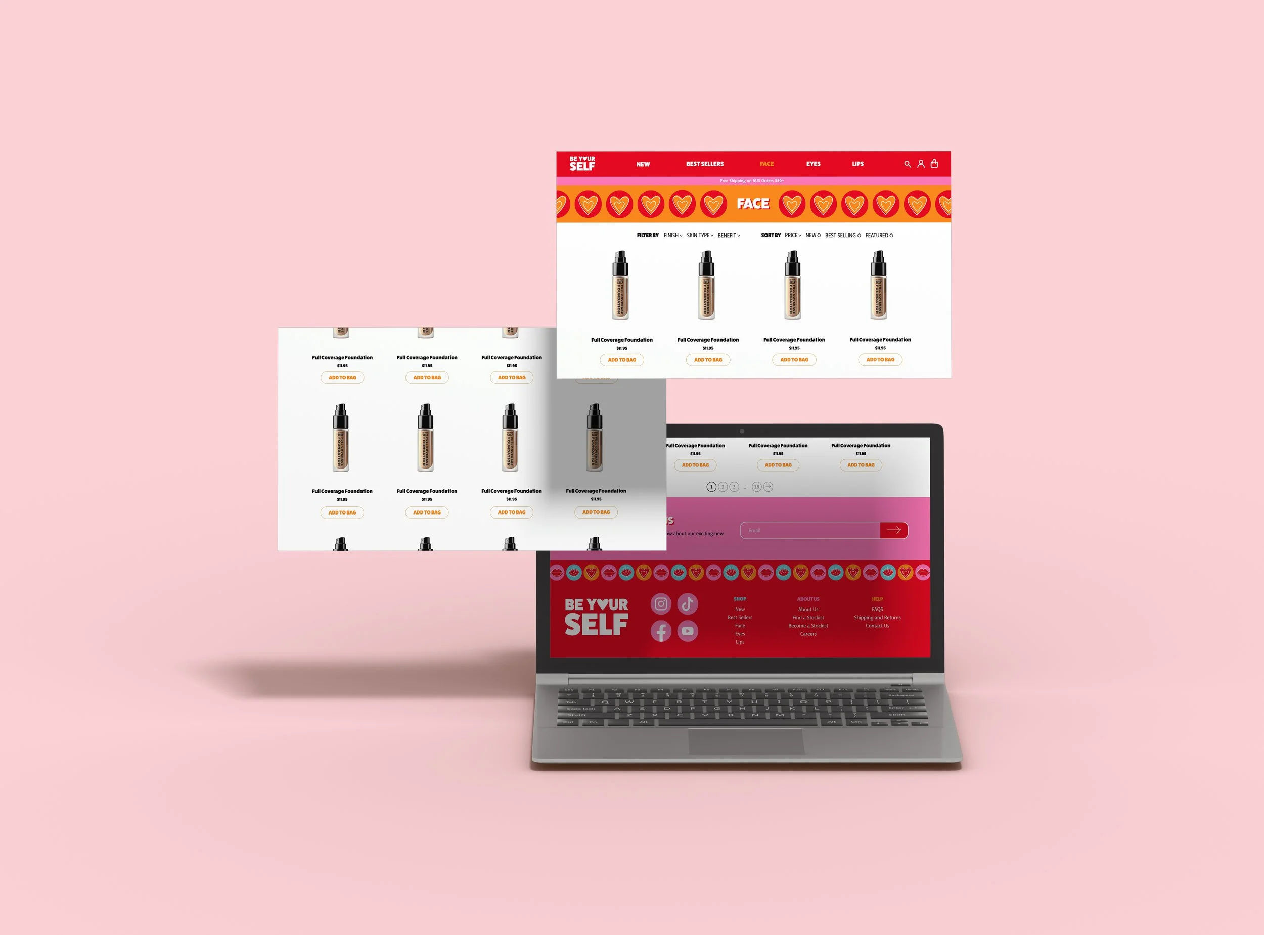
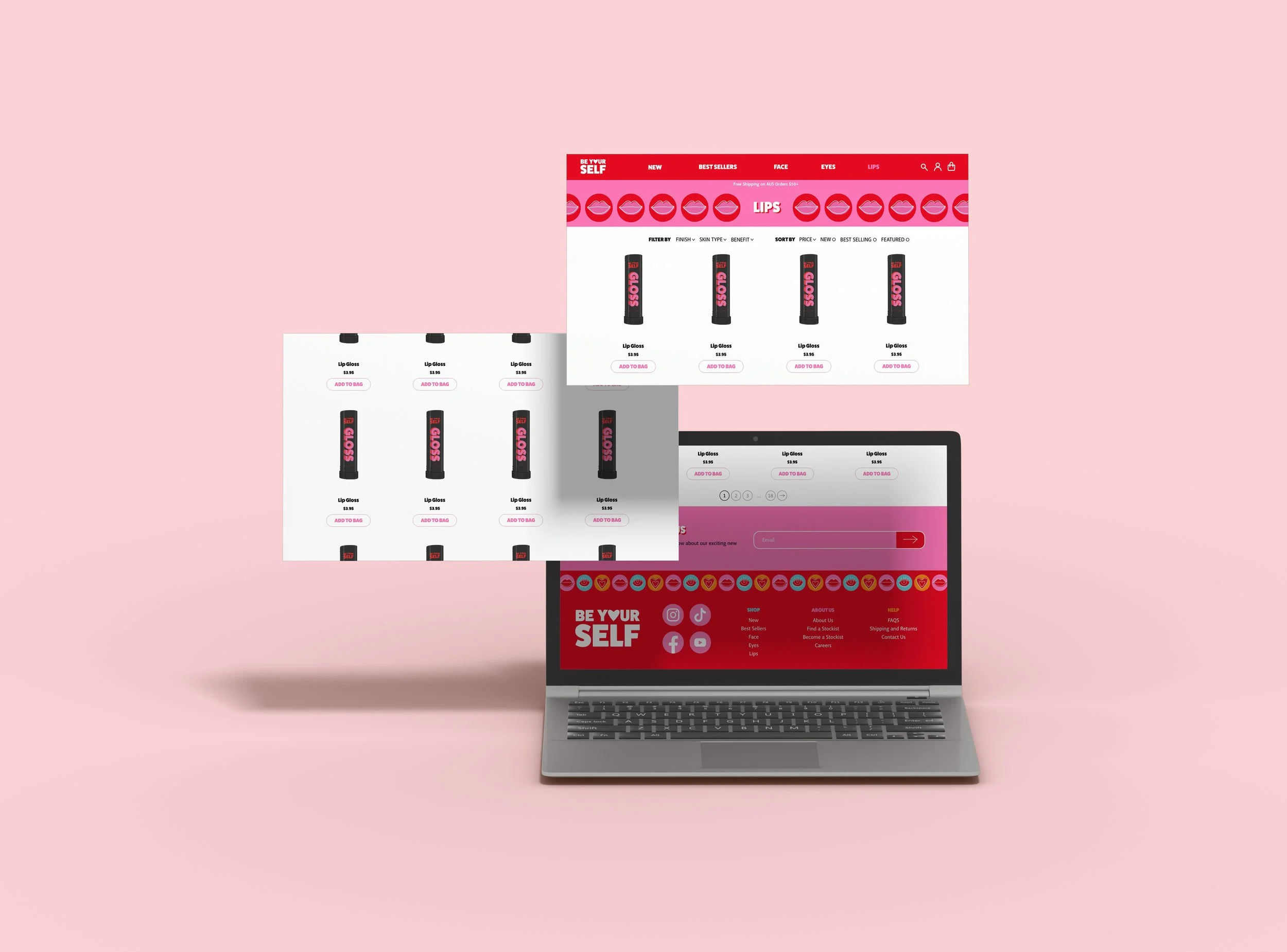
The website was redesigned to be bright, bold and eye catching.

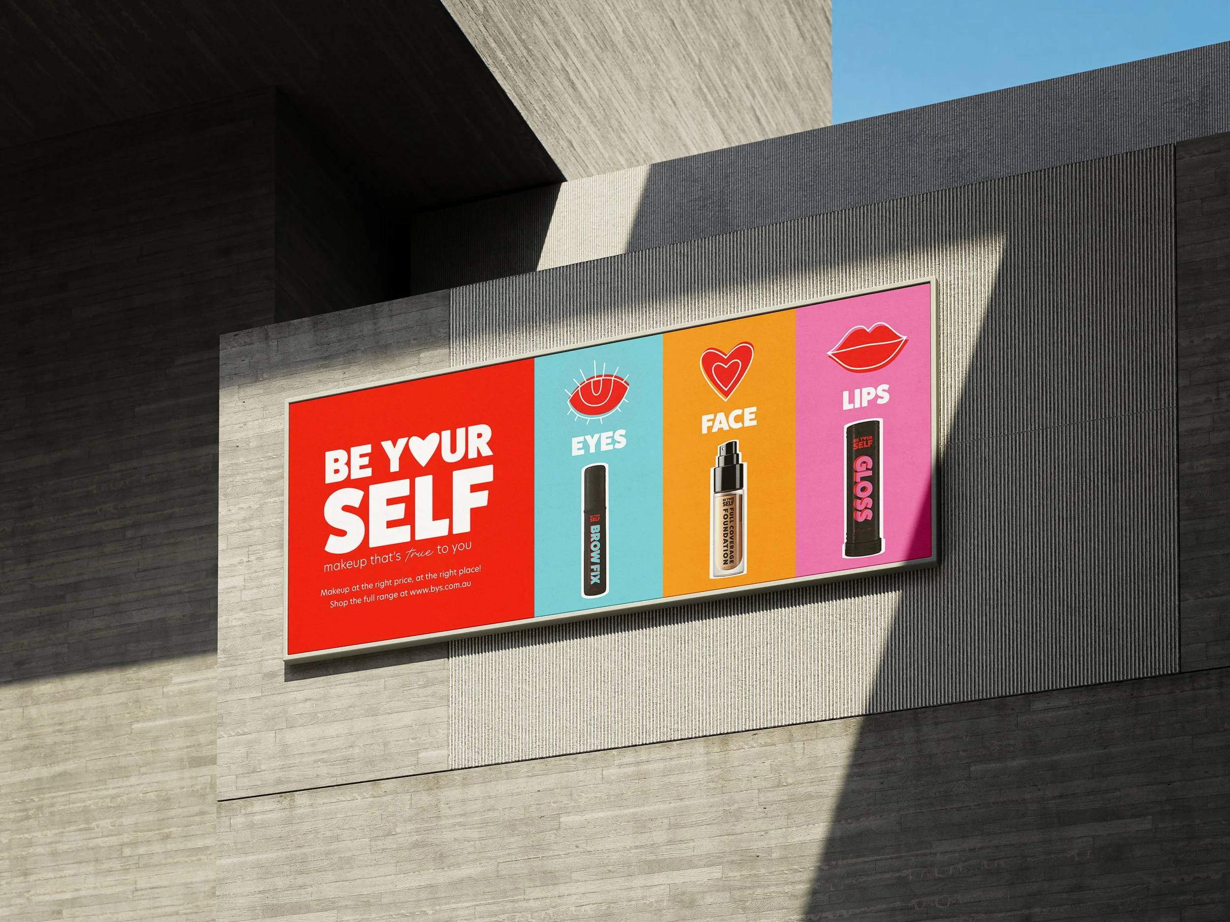
The billboard showcases three products from the brand with their representative colours and symbols.
The first poster highlights the brand itself and shows how the products can be used. The second poster communicates the brands message and values.


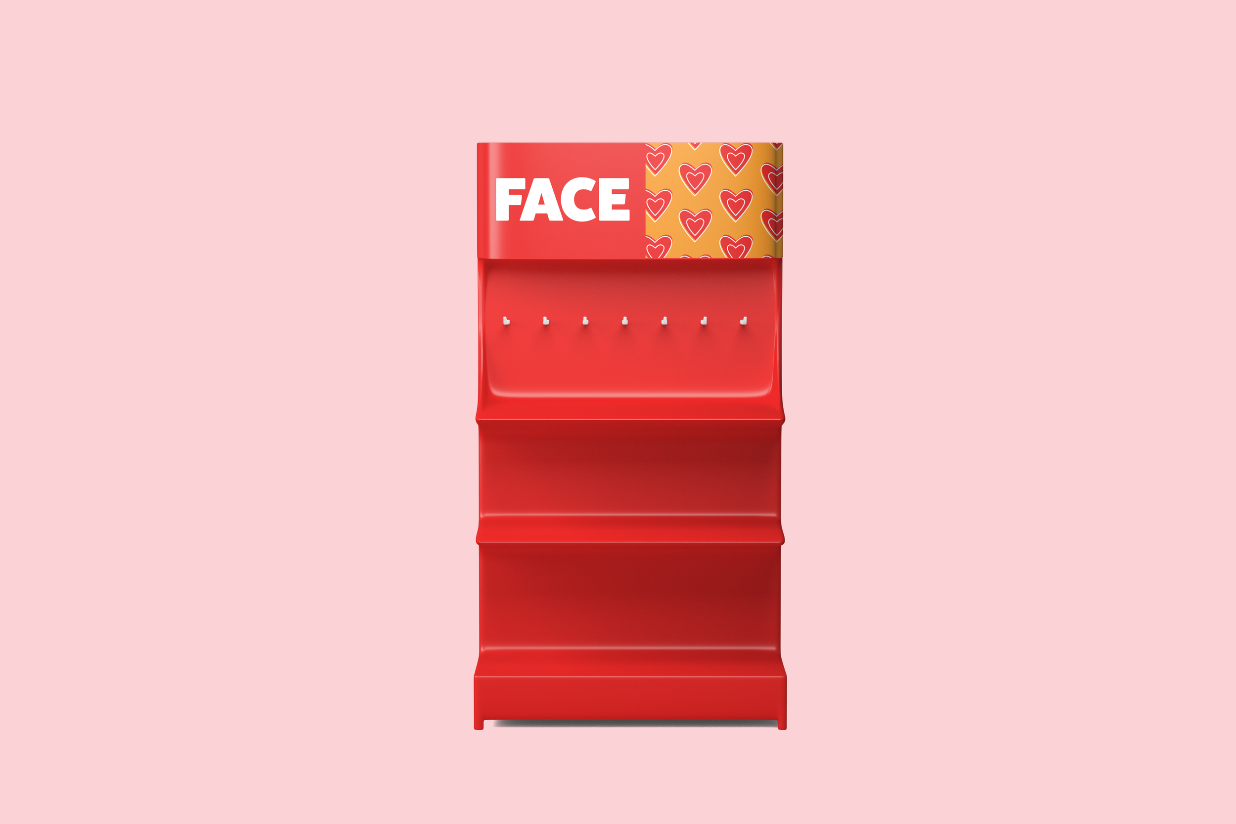
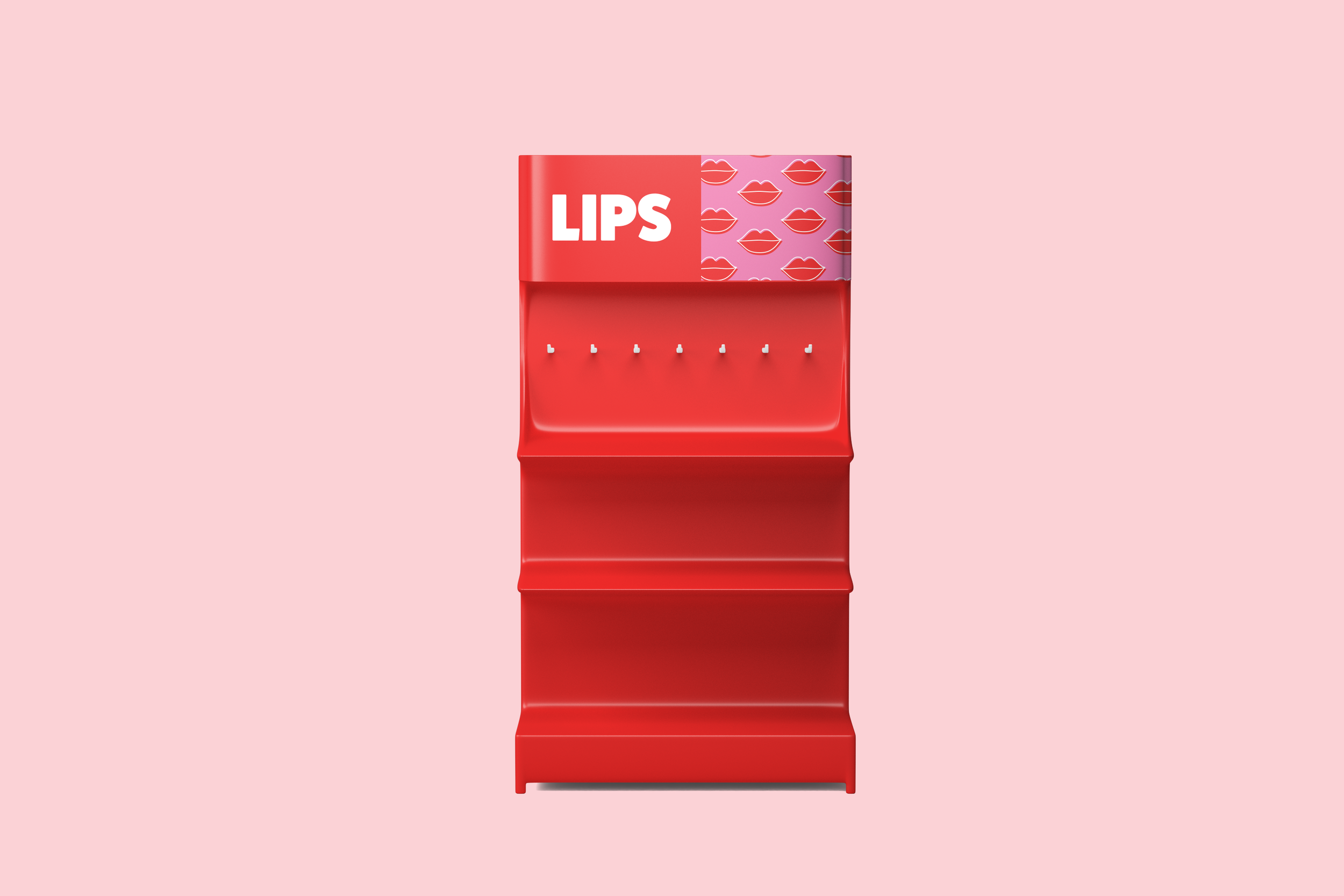
The point of sale signs will hang above the shelves in stores. It is split up into eye products, face products and lip products, any other products or makeup tools would go under the Be Your Self Logo.